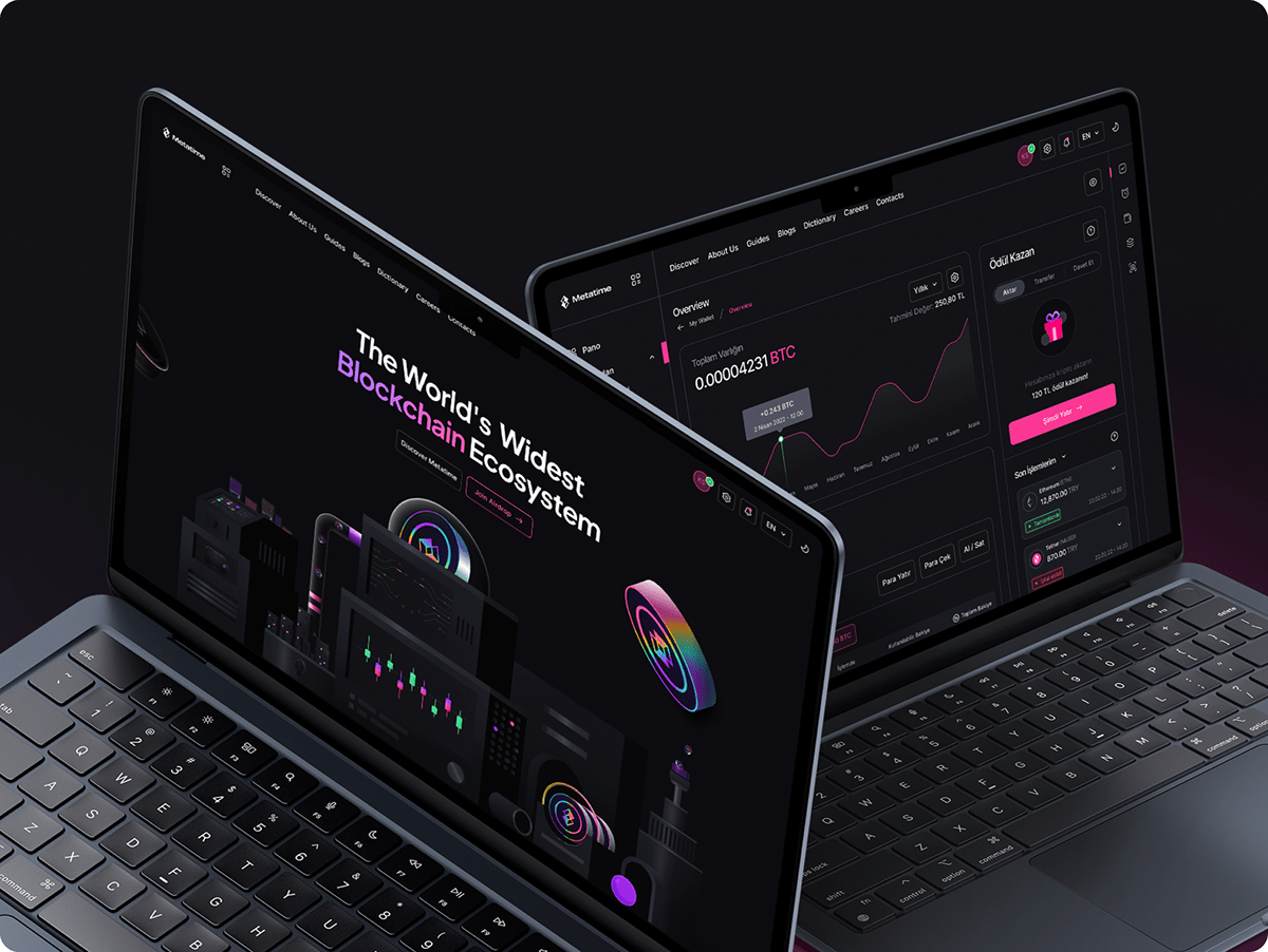
So Pink, So Futuristic.
Metatime is coming to update the blockchain world. The Metatime network was designed from the ground up to be the fastest and most secure in the world. It's a very comprehensive project with nearly 70 services, uniquely designed to meet the various needs of marketers and entrepreneurs. This is just the beginning — plenty more exciting services are coming.
We have combined what we have learned from the crypto world with our passion for design, exploration, and creativity—to bring you the best look ecosystem ever seen in the crypto world.
We have combined what we have learned from the crypto world with our passion for design, exploration, and creativity—to bring you the best look ecosystem ever seen in the crypto world.
Thinking, Taking a step,
Metador's Dream
Metador's Dream
Metatime's new logo was designed using simple geometric elements that allude to the principles of cryptocurrency. Expertly, we focused on the core values of the Metatime space: time, chain, and key.


Colors that Connect
Colors that Inspire
Colors that Inspire
So pink, so futuristic. The color pink was quite challenging for us at first, but through trial and error, we realized that this color attracts people in a way that no other color can.
The new gradient pink color scheme is the perfect accent for the new blended, layered look. The various layers of pattern and depth reflect perfectly abstract shapes and atmospheric look that makes the Metatime design systems.


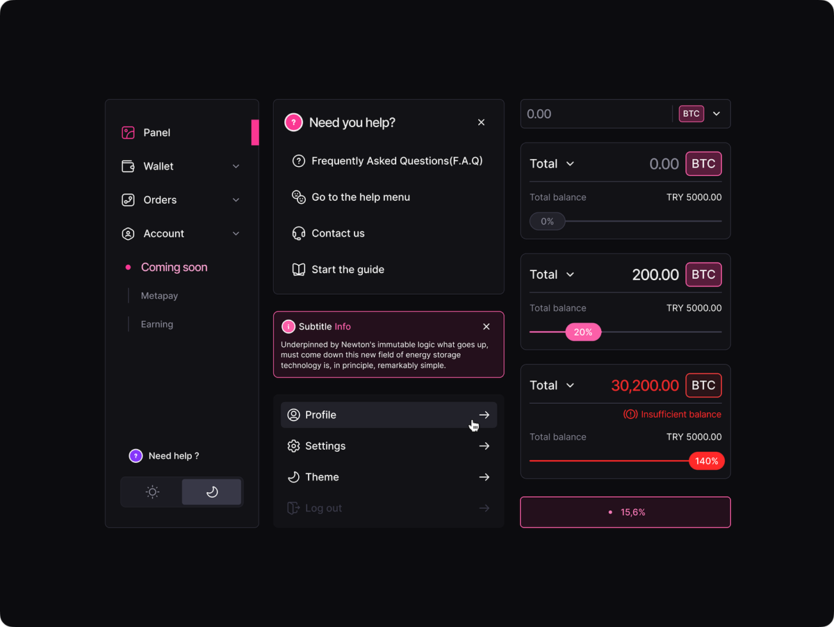
Design System
Metatime, Discover,
Share, Transform


UI Concept
Metatime, Discover,
Share, Transform


Mobil
Swipe bottom to,
Innovation.
The Metatime app consolidates all of your services in one location. You don't need to search for anything because you can see your entire Metatime universe in one place.
We created an application that is simple to use for all users, including you. We designed a setting where a single app can display the Metatime universe.
We created an application that is simple to use for all users, including you. We designed a setting where a single app can display the Metatime universe.


Social Media
Metatime Discover,
Innovation & Share.
Visual Elements
Futuristic yet nostalgic.
Metatime illustrations start with a solid horizontal line at the bottom of the page. The assets are then filled with soft yet striking pink that create a bright atmosphere. Next, you see the gradient color scheme and the layered look in different sizes and shapes, making an exciting play of light and dark colors.

Branding:
Erdem Tonyalı, Sencer Buğrahan, Onur Gür, Ramazan Özkan
Erdem Tonyalı, Sencer Buğrahan, Onur Gür, Ramazan Özkan
UI/UX Design:
Sencer Buğrahan, Onur Gür, Çağakan Bağcı, Emre Duran, Halil Yaşar
Sencer Buğrahan, Onur Gür, Çağakan Bağcı, Emre Duran, Halil Yaşar
Illustration:
Sencer Buğrahan, Melis Bıyıkcı
Sencer Buğrahan, Melis Bıyıkcı
Art Direction:
Sencer Buğrahan
Sencer Buğrahan
Project & Account Management:
Ekrem Orcan, Buse Energin
Ekrem Orcan, Buse Energin
Behance Case Design & Animation:
Halil Yaşar, Furkan Şimşek, Zeynep Sena Binici
Halil Yaşar, Furkan Şimşek, Zeynep Sena Binici


